MINARDO

A tool for visualising complex time course data from high-throughput mass spectrometry experiments.


Minardo is a web based tool that allows researchers to examine large datasets generated by today's high-throughput mass spectrometry experiments.

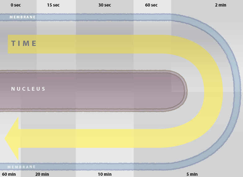
Visual analysis of time-series data on protein phosphorylation presents a particular challenge: bioinformatics tools currently available for visualising 'omics' data in time series have been developed primarily to study gene expression, and cannot easily be adopted to phosphorylation data, where a single protein typically has multiple phosphosites. This layout utilises a frame of reference familiar to life scientists and helpful for organising and interpreting time-series data.

UNTANGLING THE HAIRBALL


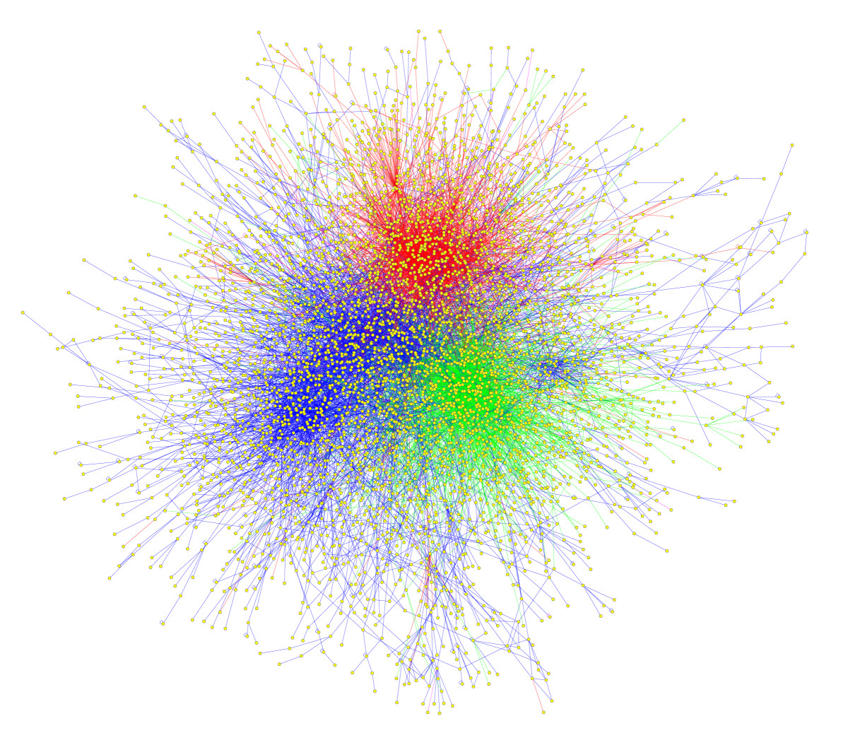
Minardo solves the biggest problem that researchers visualising proteomics diagrams face today - The Hairball.

In the field of proteomics, the hairball is a very common sight. A common cell will contain tens of thousands of different types of proteins, each of which interacts with many other different types of protein. Mapping these interactions quickly turns proteomics diagrams into an uninformative hairball.

Minardo solves the hairball by combining interaction data with time series data. In the prototype we have used mass spectrometry measurements of phosphorylation abundance ratios, which correspond to activity of proteins. Using this data we can filter and lay out an interaction network in a cleaner and more meaningful way than the current generation of automatically generated interaction diagrams. Of course, automatic layouts aren't always perfect, so Minardo is also a suite of tools that allows researchers to build and manipulate interaction networks so that they accurately reflect current knowledge.

Picture used under Creative Commons.
"From Helix to Hairball by Arthur Lander"
dx.doi.org/10.1186/1741-7007-8-40

MODERN DESIGN


Minardo is put together using techniques in line with current Human Computer Interface theory and design considerations.

In our prototype, Minardo takes time series mass spectrometry data on the abundance of each phosphosite. This can then be used to estimate a time point in which that phosphosite is activated. Distilling large amounts of information into a single definitive estimation is very important because it transforms the data into something which can be visually displayed in a very human readable format. This transformation is similar to how the Fourier Transformation works (depicted in the animation).

To further decrease cluttering, Minardo redraws network hubs as long, thick lines that stretch around the diagram. This adds another visual channel, and vastly reduces edge crossings, which decreases the cognitive load placed on the viewer.

One strategy for addressing these challenges is the application of principles of visual analytics, which takes advantage of the remarkable visual processing capabilities within the human brain for analyzing patterns and images. Applying such techniques in combination with interactive data visualization and analysis is a promising approach to improving the management and interpretation of the large and complex datasets in the life science.

Our layout strategy is named 'Minardo' as it was partly inspired by the well-known information graphic published by Minard in 1869, showing Napoleon's disastrous Russian campaign of 1812 - regarded as an exemplar by many data visualization specialists.

MODERN TOOLS


Minardo has been built with modern web development tools such as Node.js and D3.js


Node.js

Website

Node.js

Node.js® is a platform built on Chrome's JavaScript runtime for easily building fast, scalable network applications. Node.js uses an event-driven, non-blocking I/O model that makes it lightweight and efficient, perfect for data-intensive real-time applications that run across distributed devices.

D3.js

Website

D3.js

D3.js is a JavaScript library for manipulating documents based on data. D3 helps you bring data to life using HTML, SVG and CSS. D3’s emphasis on web standards gives you the full capabilities of modern browsers without tying yourself to a proprietary framework, combining powerful visualization components and a data-driven approach to DOM manipulation.


PUBLICATIONS


AWARDS


  • Finalist for the 2015 Eureka Prize for Excellence in Interdisciplinary Scientific Research
    University of Sydney; CSIRO; and Garvan Institute of Medical Research
    The BioCode project used 'omics' approaches to unravel, in unprecedented detail and clarity, the insulin/IGF1 signalling pathway that plays essential roles in health, obesity and diseases such as diabetes. The BioCode team have developed innovative analysis and visualisation methods that will benefit researchers in many areas of life science.

  • Visual Analytics of Signalling Pathways Using Time Profiles.
    Minardo: Untangling the Hairball
    At VIZBI 2016 I presented a physical version of my Cell Snapshot - unlike a traditional scientific poster, this poster was an A0 laminated physical printout of the website, with pop-up flaps in place of the interactive parts of the diagram.
    In this way the viewers were encouraged to interact with the poster and the benefits of having an interactive diagram were immediately recognised.


Contact Information

The Garvan Institute
370 Victoria St, Darlinghurst NSW 2010
Enquires: hello@david-ma.net
@minardoapp

Created by David Ma and O'Donoghue Lab